
Top Tips for Designing Well
Not every comms team has the resources to have an in-house designer or creative, which can lead to less efficient workflows and less engaging communications with tenants. This skills gap can be hard to fill, but there are a number of useful tools available which can have a big impact on your digital comms output.
Tools
Most of your outputs are now digital and the varied and accessible tools now available to us makes this much easier to do. Here are some of my go-to tools:
Adobe Photoshop/Illustrator – View Page
Monthly fee
Windows and Mac
The Adobe Creative Cloud suite is the go-to professional toolset. Although it offers a host of functions, it’s also very expensive and can be hard to learn without additional investment in relevant training. I’d only recommend this if you’re recruiting a designer or creative professional.
Canva – View Page
Free with optional paid bits
Windows, Mac, Mobile/Tablet
This is a free and easy-to-use online platform that is proving very popular for non-design comms people (especially as it can be used across teams). It has useful pre-built templates but also allows you to import images and create your own look and feel. There are paid premium features but it’s a versatile enough tool without them.
Affinity Photo – View Page
£48.99
Windows, Mac, Tablet
A direct competitor to Photoshop, Affinity Photo has pretty much all of the capabilities as Photoshop and costs less than £50 – a one-off cost. Affinity Photo is extremely powerful and gives a more professional result, you can also watch good tutorials by the founders on YouTube.
GIMP – View Page
Free
Windows
A free, open-source program that has quite a lot of functionality. It’s not super user-friendly but simple enough to pick up. It has more functions than Canva but has a steeper learning curve.
Tips
KISS: Keep It Simple, Stupid
One of the biggest mistakes I see from inexperienced designers or non-designers is overcomplication. It’s important to draw a line between design and art. Design is first and foremost a means of communication. If something is not needed in a design, take it away – though that isn’t to say things shouldn’t look professional and well made!
ACES: Audience, Context, Expectation, Stats
Audience – Who is this content aimed at and why is it relevant to them? What are the accessibility considerations (e.g: access to technology, physical impairments, learning difficulties etc.)? Quite often, we forget the whys, which are key to understanding what you need to create.
Context – Where or how is this going to be accessed? Is it a simple social media image? Is it part of a wider campaign? Is it going to be printed? What kind of devices will likely be used? How are users engaging with this content? Is it a one-way communication or is intended to be a back-and-forth dialogue? Does it align with your organisations overall brand, tone of voice, and goals?
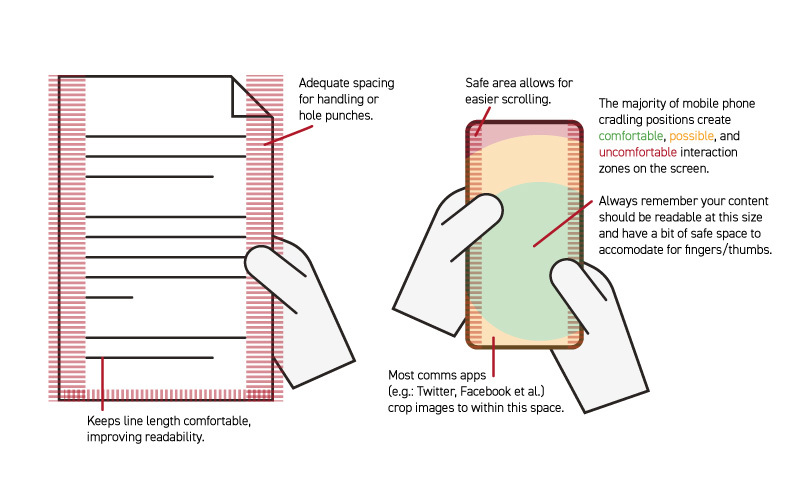
With digital, different devices display content in different ways. Desktops/laptops are typically landscape and benefit from large screen resolutions. Mobile devices are portrait and narrow, but also require a region of the screen to be covered either by app user interfaces (UI) or by fingers/thumbs, so need larger “safe” zones so important details aren’t obscured. However, ALL designs should keep text away from the edges of a design (about 5-10% minimum!) to avoid accessibility issues or losing key bits when cropped by social media.
 Expectations – What do you intend to achieve with this? Are you expecting users to engage with this directly? Does the design convey that?
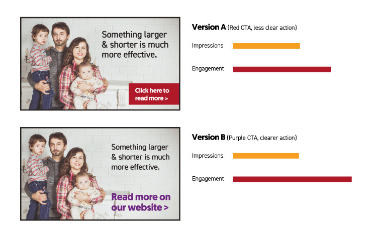
When designing something you should consider your expectations. If there is a call-to-action (e.g. Do X Now!), ensure it is more visible and prominent through use of colour, size and shape to make it distinct from surrounding elements, and that it clearly conveys what the user is intended to do or should expect when clicking.
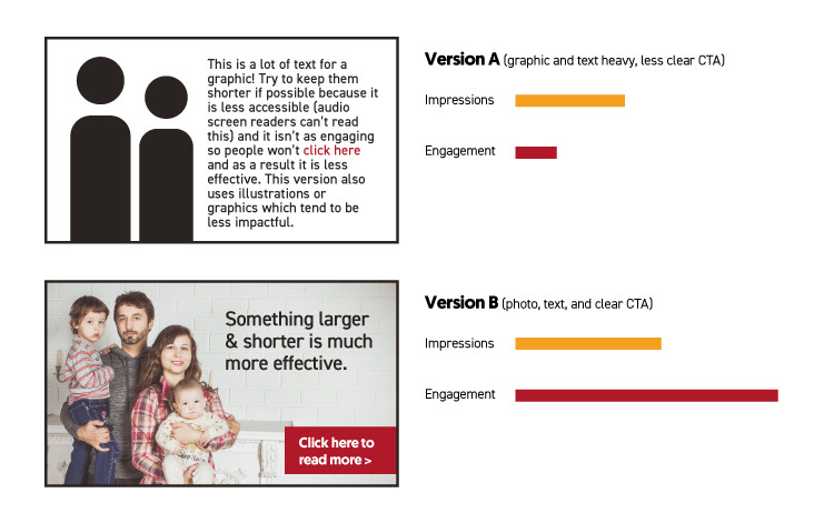
If something is informative or prompting engagement, make it as engaging as possible with bright and friendly visuals. Illustrations or icons are nice, but ideally use good quality photography of people or local places where possible to improve engagement. People empathise with people and will inherently be drawn to them (though genuine photos are much more effective than stock photography or obviously staged ones!).
If it is something urgent or of critical importance, use shorter, snappier language and reduce visual clutter – think road or toilet signs – you don’t have time to decipher more than a few words or process detailed graphics when driving or bursting for the loo, and people scrolling on social media or websites need to be approached in the same way if something is vital.
Stats – Is there data that can help influence your design? What has worked best in the past in terms of engagement and/or conversion? Are there any statistics for your audience from your organisation or elsewhere? How will you gather the stats from this design (e.g. analytics, anecdotal feedback, etc.)? How will you use the stats to influence your designs going forward? Will you do A/B testing to see which design works best?
That covers the basics! But for now, all you need to remember is KISS and ACES!
Josh Rousen is Brand and Design Creative at Community Housing Cymru
Tools
Most of your outputs are now digital and the varied and accessible tools now available to us makes this much easier to do. Here are some of my go-to tools:
Adobe Photoshop/Illustrator – View Page
Monthly fee
Windows and Mac
The Adobe Creative Cloud suite is the go-to professional toolset. Although it offers a host of functions, it’s also very expensive and can be hard to learn without additional investment in relevant training. I’d only recommend this if you’re recruiting a designer or creative professional.
Canva – View Page
Free with optional paid bits
Windows, Mac, Mobile/Tablet
This is a free and easy-to-use online platform that is proving very popular for non-design comms people (especially as it can be used across teams). It has useful pre-built templates but also allows you to import images and create your own look and feel. There are paid premium features but it’s a versatile enough tool without them.
Affinity Photo – View Page
£48.99
Windows, Mac, Tablet
A direct competitor to Photoshop, Affinity Photo has pretty much all of the capabilities as Photoshop and costs less than £50 – a one-off cost. Affinity Photo is extremely powerful and gives a more professional result, you can also watch good tutorials by the founders on YouTube.
GIMP – View Page
Free
Windows
A free, open-source program that has quite a lot of functionality. It’s not super user-friendly but simple enough to pick up. It has more functions than Canva but has a steeper learning curve.
Tips
KISS: Keep It Simple, Stupid
One of the biggest mistakes I see from inexperienced designers or non-designers is overcomplication. It’s important to draw a line between design and art. Design is first and foremost a means of communication. If something is not needed in a design, take it away – though that isn’t to say things shouldn’t look professional and well made!
ACES: Audience, Context, Expectation, Stats
Audience – Who is this content aimed at and why is it relevant to them? What are the accessibility considerations (e.g: access to technology, physical impairments, learning difficulties etc.)? Quite often, we forget the whys, which are key to understanding what you need to create.
Context – Where or how is this going to be accessed? Is it a simple social media image? Is it part of a wider campaign? Is it going to be printed? What kind of devices will likely be used? How are users engaging with this content? Is it a one-way communication or is intended to be a back-and-forth dialogue? Does it align with your organisations overall brand, tone of voice, and goals?
With digital, different devices display content in different ways. Desktops/laptops are typically landscape and benefit from large screen resolutions. Mobile devices are portrait and narrow, but also require a region of the screen to be covered either by app user interfaces (UI) or by fingers/thumbs, so need larger “safe” zones so important details aren’t obscured. However, ALL designs should keep text away from the edges of a design (about 5-10% minimum!) to avoid accessibility issues or losing key bits when cropped by social media.
Expectations – What do you intend to achieve with this? Are you expecting users to engage with this directly? Does the design convey that?When designing something you should consider your expectations. If there is a call-to-action (e.g. Do X Now!), ensure it is more visible and prominent through use of colour, size and shape to make it distinct from surrounding elements, and that it clearly conveys what the user is intended to do or should expect when clicking.
If something is informative or prompting engagement, make it as engaging as possible with bright and friendly visuals. Illustrations or icons are nice, but ideally use good quality photography of people or local places where possible to improve engagement. People empathise with people and will inherently be drawn to them (though genuine photos are much more effective than stock photography or obviously staged ones!).
If it is something urgent or of critical importance, use shorter, snappier language and reduce visual clutter – think road or toilet signs – you don’t have time to decipher more than a few words or process detailed graphics when driving or bursting for the loo, and people scrolling on social media or websites need to be approached in the same way if something is vital.
Stats – Is there data that can help influence your design? What has worked best in the past in terms of engagement and/or conversion? Are there any statistics for your audience from your organisation or elsewhere? How will you gather the stats from this design (e.g. analytics, anecdotal feedback, etc.)? How will you use the stats to influence your designs going forward? Will you do A/B testing to see which design works best?
That covers the basics! But for now, all you need to remember is KISS and ACES!
Josh Rousen is Brand and Design Creative at Community Housing Cymru